Welcome,
This week my students and I have been talking and thinking about how to create a wheel of colour from a first split primary palette using only 6 pigments. Having done this I have been exploring how these colours relate to one another, because as artists this is paramount to good painting outcome. Our eyes tend to try to balance colour naturally this means they try to see a colours compliment this is what creates a harmonious colour way and what makes us feel uneasy or challenged. Yes I am a believer that colour really is that powerful at a conscious and subconscious level.
A colours compliment sits opposite on what is called the colour wheel and this week I have been showing students how to mix a split primary colour wheel using two of each of the primary colours.
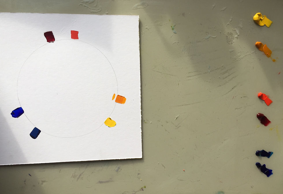
Ideally we would be able to mix all of our colours from 3 primaries but our coloured pigments are not pure enough to do this so we need a warm and cool of each of the primary colours [see below first split primary palette] in oil colour.
At the top you have Alizarin Crimson on the left and cadmium red on the right
At the bottom you have Lemon Yellow on the left and Indian yellow on the right
To the left you have Phthalo blue on the bottom and Ultramarine blue on the top
These 6 pigment colours are all you need to make a good spectrum of colour.

Notice there is a gap left in between each of the 3 primary colours we will need this later, so if you are laying this out yourself to do which I encourage you to do make sure you leave one.
So having laid out a warm and cool of each primary colour i now mix the secondary colours of orange
green and violet. Pigment varies in intensity depending on what it is so when mixing these its not quite as simple as using half and half of each, however when you are mixing remember to mix the darker pigment into the lighter one its easier to control and be aware that a small amount of oil pigment can make a significant difference.


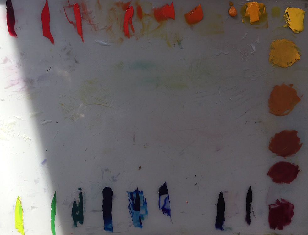
Now below I have mixed in between each of the above colours to create an easy transition from one pigment to the next. Be sure to give this a try and let me know how it works out for you.


All that was left now was to mix in between each of the primary reds, yellows and blues and that is my split primary palette.

Once we have mixed this split primary pallette its interesting and simple to see where each complimentary colour is,they are opposite one another. It may help you to draw a line between them starting with Alizarin crimson and Cinnabar green light and gradually work your way around.
Doing this will enable you to see clearly which complimentary colour to use when you wish to drop the tone of a colour rather than trying to do this with black or brown. I have laid out the transitions for you below laying them out in a line.

Once the colours with their compliments are laid out opposite each other i have mixed from one to the other in 4 stages.Below I have shown you how I have used a square tip knife tool to pick up a pile of yellow and gently wipe four decreasing amounts of yellow in each one and doing the same with the violet, this then makes it easy to mix and I do this form lightest colour to the darkest as you can see below.

Here is the palette of all 9 compliment colours from Alizarin crimson to Lemon yellow.

Below I have mixed Alizarin crimson through to its compliment Cinnabar green light.

Below is Vermilion red mixed through to its compliment of sap green.

Below is Cadmium red mixed through to its compliment Phthalo green [Teal].

Below is Azzo coral [cadmium orange deep]mixed through to its compliment of Phthalo blue

Below is orange mixed through to its compliment cobalt blue [ ultramarine and phthalo mix]

Below is Indian yellow deep mixed through to its compliment of ultramarine blue.

Below is Indian yellow mixed through to its compliment of Ultramarine violet.

Below is Cadmium yellow deep mixed through to its compliment of Violet.

Below is Lemon yellow mixed through to its compliment of Madder [Alizarin violet].

Below is a chart that would be a great exercise for you to do and have as a working document that can be referred to whenever necessary.

I will follow up this post with a similar colour mixing chart for acrylics and water colour. This is necessary as in different media colours can be called something different. This is why I urge you to look at the colour rather than its name.
Do let me know if this has been useful for you and to my students this is something that you can refer to again and again, enjoy your painting, until next week guys when I will be looking at mixing colour with acrylics and water colours to provide you with some comparison pigment charts.

